


Floral Noise #5 - Ivy Jukebox
- andreahywong

- Feb 9, 2021
- 7 min read
Updated: Mar 5, 2021
It’s been a very very long time! The holidays and really all of January 2021 were very busy with packing, unpacking, and cleaning because I’ve moved into a new place!

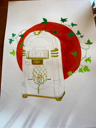
I received these beautiful watercolour jelly gouache paints for Christmas and finally finished another addition to the #floralnoise collection. An Ivy Jukebox!
Sketch
Prior to starting, I decided to temporarily ditch the sketchbook paper and give watercolour paper a go. It appears that sometimes other papers have difficulty holding onto watercolour pigment and I definitely felt this with floral noise #4. I’d have a droplet of pigmented water, wait for it to evaporate and leave behind its pigment, but find that it seemed blotchy and not like that nice gradient colour and shape of water I expected. I have some watercolour paper from back when I headed a papercraft student club at school and so I was ready to go! Or so I thought... I quickly found that there are 2 very distinctly different textured surfaces to the paper. It turns out that there is no wrong side to use, just personal preference, so I chose the more deeply “toothed” side. [insert image of 2 sides of paper]. I would later learn that I do not like this side of the paper. XD #rip

Sketching was by far the easiest step. As usual, I used a reference image (how do artists paint straight from the image in their minds?! I can’t imagine the amount of practice and familiarity with those objects it would take to do that). I felt the style and intricacies of the jukebox fit a vine plant and decided to have it overlay a solid circle with twisty vines around the edges. I’ve seen this style with other gouache users on Instagram lots and I really love how solid the background colour and shape turns out in contrast with the foreground object! Here's a favourite of mine by @villustrate on Instagram (you won't regret checking out this artist!)
Ink - I decided not to ink this one and see where it led me!
Colour
I’d say usually the previous 4 #floralnoise practice pieces have taken around 1, maybe 2 hours from start to finish. Definitely all in one sitting. I think this one took 3-4 sittings! I decided it would be worth the prevention of future frustration by not pushing through if I was tired. You know how sometimes when you just want something done, you neglect and stop focusing on the process to finish the darned thing, and then it becomes more like grunt work than something enjoyable? Yeah, that was what I didn’t want.
Where to start...
I will start by saying I had no idea what I was doing. XD Where to start, foreground, background; what to paint, details, or solid colours. I simply started with what seemed easiest/intuitive and I think looking back, I have a few thoughts about this now in hindsight. I started painting the ivy leaves and vines to have a gradient of green and quickly learned that these paints take some getting used to! I’d say I still haven’t quite figured out the optimal amount of water to use to have a smooth gliding paintbrush: when it was too dry, you’d get these very sad non-continuous streaks; when it was too watery, the pigment was vastly diluted and the colours would become less vibrant.


I decided to make the background circle a bright red-orange. (I’ve seen some artists leave this to being the last step which might make more sense in terms of giving more flexibility when painting the edges of the object within. I’ll have to keep that in mind for next time!) You can see that the colour here is actually a little blotchy, and that’s definitely with my inability to maintain a consistency of how much water to add to have one homogenous solid colour object: the paint would get dry, I would add water, the paint would be diluted, and repeat. I think I’m definitely a bit frugal with my approach in using paint too. I would take out how much I think I’d use, trying not to be wasteful, but then I would run out. Hopefully as I practice, this will become more intuitive for me.
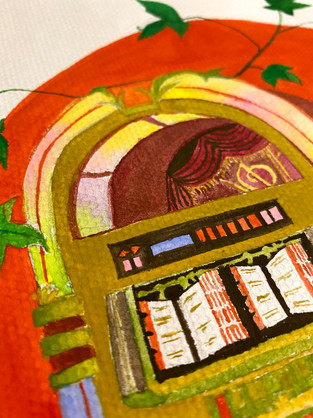
And then... a mistake I think. I decided to work on the outer details of the jukebox. I was actually really pleased with this when I painted it! The curves and swirls look pretty clear here no? It was new to experiment using different paintbrush sizes and I think I went down to a size 000 here. I thought the green-brown gradient gave the jukebox an earthier tone than the usual metallic components one would normally see in life. However, I’d later find that first working on these made it hard to paint the surrounding areas, and it ended up looking messier – less sharp edges, less clarity of the curving shapes than desired. #lessonslearned


I couldn’t decide on the colour of the larger and side surfaces, so next I tackled the fluorescent lighting fixtures and bubble tubes. I aimed for a more washed fluorescent gradient of rainbow lights, but I think I didn’t use enough water here because the pigments ended up being much thicker and saturated than what I had in mind. I’ll have to come back and experiment some more, but it was interesting deciding whether or to use only primary colours red/yellow/blues and mixing those to get the in-between secondary colours orange/green/purples, or using the ready-to-use hues of the secondary colours already pre-mixed. I think the first option would give a more genuine result and palette of colour as some pre-mixed colours had small components of other colours in their makeup.

Speaking of mixing, I’ve learned that with this gouache paint, it is much more necessary to mix before applying the paint. “Doesn’t this seem obvious?” you may think. Well, before, sometimes I could paint two colours separately, and allow the water to run between them which would mix them straight on the page. However, these paints didn’t work well this way - it felt more like two layers of different colours! Perhaps I didn’t use enough water, or they dried before I tried mixing them on the page. It’d also be neat to learn how to mix colours more accurately because that’s definitely a trial-and-error process for me. Speaking of which, this level of colour-mixing by @fritzdoesart_ should really be considered a superpower!
Anyway, the bubble tubes on my jukebox were so thin, I ended up just outlining it as a solid line with an orangey-brown rather than trying to get further details inside of these lines.
Inner Details
I tried to add some details but would have to say that some did not turn out ideal. I thought the “stage curtain” inside the top semi-circle was a nice touch, however, the yellow tassels were hard to paint cleanly. I wonder if perhaps watercolour isn’t the right medium for such detail. I can see this being much easier layering just the yellow after the red has dried with a paint such as acrylic. But... maybe I needed to use less water and just more concentrated pigment with the gouache for the same effect! Nevertheless, the “tiny-ness” made this very difficult. It’s interesting though, because now that the entire thing is finished, it’s not as catastrophic as I initially felt - probably because it’s a minuscule detail that isn’t the focus of the overall picture (although... what is? I don’t know Andrea, I just don’t know).

The text and tabs of the song selection pages were a fun touch and I felt adding this detail added some depth! The hooks were impossible for me though. I’m not sure if I just need to be more patient to let things dry before applying more paint, but the hooks here on the pages are not very clear.
The buttons were also interesting – I wanted to use different colours than my reference picture that suited the colours I chose for my jukebox but didn’t really what to choose.

You can see in the reference image that there’s a digital screen in this one, with numbers and red/turquoise(?) buttons. I ended up choosing this weird pink blue combination and quite honestly, I’m not sure how I feel about it. There are definitely some details I left out on purpose for simplicity (numbers, arrows, text…)
Surfaces
The remainder included the side and front surfaces and I ended up going with a less risky colour choice - brown. Earthy enough to fit the overall tone, although I was really thinking of trying something else. Perhaps another time! For the side surface, I thought a dark chestnut colour would look nice and ended up using a deep maroon(?) colour I had in my palette. It’s actually not entirely consistent, because later I would go in to fill some shadows to give it more depth and used a dark brown instead. I think next time, I could outline some angles and contours, but I wasn’t to sure how to do this as an afterthought because I had already gone in with solid colours in mind for these parts. The lighter brown I chose for the front surface was probably the hardest decision in terms of choosing colour in this painting. The front surface being blank, showed a lot of white space. I think because of the large surface area of this section, it was a bit unnerving to decide on a solid colour for the entire space. Instead of choosing some wacky colour, I chose one of the more classic colours for this front piece – brown (black is another option but I felt that was too stark and finite for the earthy look I was going for).


Tada!
And there you have it! An imperfect but finished painting! It’s interesting to pull back and look at it in its complete “bigger picture’ view. I spent most of the time focused in on the little components – turns out despite the hiccups here and there, the overall look isn’t too shabby! Can’t wait to try these paints on the next #floralnoise painting. Onwards!


Comments